Mar 4, 2015 | Ebook Cover
You have made a cover for a story set up in Paris in the night, or a mystery story. So you look on the Internet to look for some very “cool” font, something very Italic or creative, with many curves. Forget it. Let’s look to an example, but this time...

Mar 4, 2015 | Ebook Cover
Space is like drawing, and it’s like writing. You just have to be balanced, in harmony with every other object inside the cover. It’s the same as using metaphors in your writing, for example. You have to give them space, but you can’t neither give...
Mar 4, 2015 | Ebook Cover
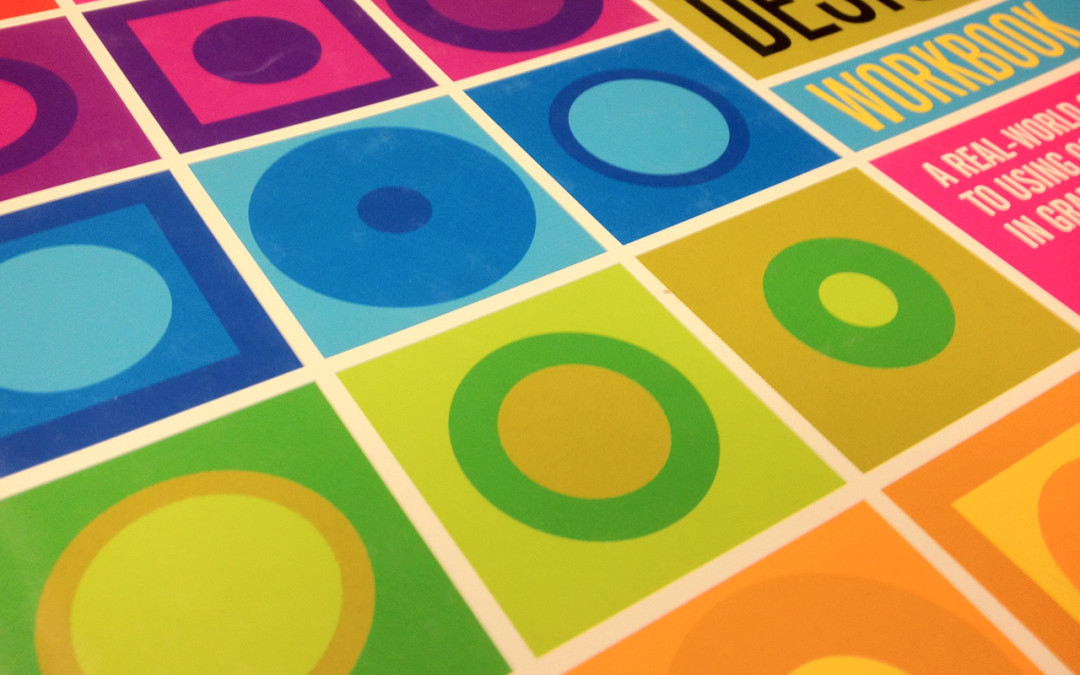
Among the many aspects one has to meet with, there’s the one of colors. It’s one of the most difficult to manage, but here we’ll explain some helpful tricks. It’s hard to use correct colors because they have to be in harmony among them, they...

Mar 4, 2015 | Ebook Cover
About drawings, it’s valid what we have said in this post about getting together images. Try to not make them by yourself. It’s a general rule for everything. It’s good you can create your own cover, but use good quality images, always, as the ones...

Mar 4, 2015 | Ebook Cover
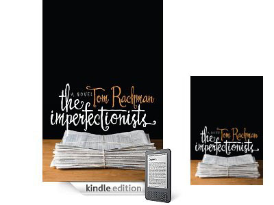
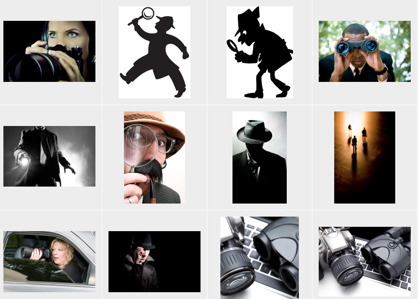
As we saw in a previous post, you have to be careful about clichés when designing your cover. We’ll see here other examples. About Africa there were especially landscape clichés, but they’re not the only kind. There are others more symbolic that maybe we...
Mar 3, 2015 | Ebook Cover
Background photos are extremely important when you’re making your cover. Although a cover conveys a mixed message of images, texts and colours, the first impact one reader has is on the photo. So, how to choose a good one? There is a very important rule to follow: be...