Background photos are extremely important when you’re making your cover. Although a cover conveys a mixed message of images, texts and colours, the first impact one reader has is on the photo.
So, how to choose a good one? There is a very important rule to follow: be original and give the mood of your story, not the facts.
A thing that is quite fundamental, as we saw in some precedent articles, is to avoid as much as possible clichés.
In second instance, you have to understand that is not necessary to put an image which you feel to be perfect for the reader, to let him understand the novel. This is the wrongest thing you can do.
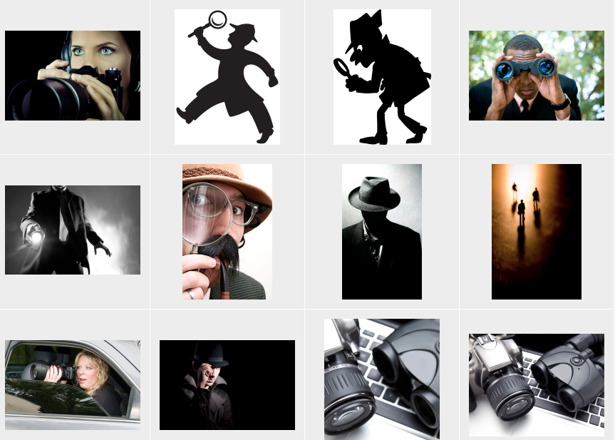
Let’s make an example. You have a detective story in your hands. Maybe you found a photo that depicts perfectly your detective. Or you found an image the coincides perfectly with the main evil character, or with the victim. Some examples are in the photos and images above.
In these cases, what you are doing is just taking away the imagination from the reader, that is the most important thing while reading. It’s not a movie. Let readers form their proper image of characters and settings. When you are selecting a background picture, avoid anyone which will represent any person or object of the story. It’s just not nice to give to the reader, for example, a photo of one character, before one can actually step into the story and read about it.
You have to choose an abstract image, one which will convey what is the general mood you’re conveying inside the story. But avoiding clichés. For a detective story maybe it’s better to stay away from foggy streets in the night, for example. But the use of a big fingerprint is not so much misused, as image.
Still better it’s to use a more abstract photo, which will not remind the reader exactly what is about the story – in the example before, a fingerprint could suggest the reader that the story will focus on its finding.
Here below there are some more examples of Indie authors. In fact , are the kind of authors who make these mistakes more often, say because they want to spend not so much money, or they just don’t know how to do it or choose it.
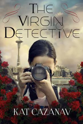 As you can see this on the left is one cover which doesn’t respect the rules said above.
We can see who the main character will be, and how she is, taking off the opportunity for the readers to imagine her.
More than that, we see also the city where the novel is set. We’ll have already an idea – either could be wrong or correct doesn’t matter – of what is the story about, and loose a little interest in it.
What is the story about? “Where there are roses there’s dead bodies and no one knows this better than Poppy Rae Mamadou….” It’s just the beginning, but we inferred many things from the cover. We already know which kind of roses are, where is it, how is Poppy Rae… we can almost make the story ourselves.
Let’s see a good example now.
 Here on the right we have as I said above a good example of abstract image. Let’s see what is this story about: “A double homicide leads Detective Paul Friedman to discover the threat of an imminent terrorist attack on the city of Orlando, Florida… ”
Can you infer that from the cover? Of course not. The cover in this case gives you an abstract image that says: in this book time will pass quickly, there will be lacking of time, etc.
The author encourage us to buy it to see what this story is really about.
Other very important features to consider in your cover are simplicity and clarity.
Just talking about photos and background images, there should be just one. The cover itself is like a story, and it has to make a point. If you put two or three images one above the others, or next to them, it will convey a very complicated message to the reader, who will probably skip over it.
Remember that the cover has just the function of attracting the attention in the readers, not to tell what is the story about. So, in the end, as I said, with the background image set the mood.