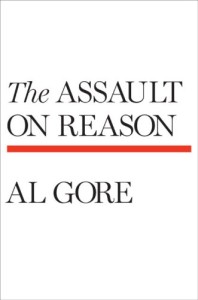
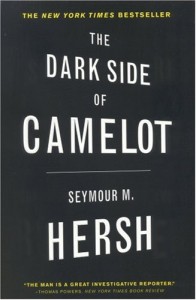
Have you ever thought about not putting any background picture to your cover? Already wrinkling your nose? But still, it could be the best solution. Pictures help but they aren’t everything. There are many already published covers that don’t use images. Let’s see some examples here below:
Ok, most of them are not for sure fantasy or mystery kind of stories. As a matter of fact, we can say that mostly good typesetting is from essays or descriptive books. Still, there are examples of good covers used by novelist. Here there’s one:
All these covers were taken as examples from bookcoverarchive.com. It’s basically an archive in which you find lots of covers of already published authors. It’s a good source from which you can take inspiration.
Now, if you want to take this way for your covers you have to try many times before getting one which will suits your story. You just have to choose the right colors, the right fonts – look this post in which we’re talking about them – and right spacing between the letters.
Shadows and other effects
Small effects like shadows are alright. But it’s not just a coincidence that in our creator we didn’t put any 3D or big drop shadows effects. The reason is even though you can think they help the text to stand out, actually they make it more complex. It’s harder for the eye to understand.
It’s ok sometimes to use a shadow for an image, but avoid it whenever possible for texts. If you want to let them stand out, work on and experiment new colors and font types.
