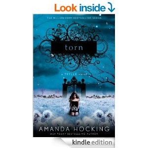
You have made a cover for a story set up in Paris in the night, or a mystery story. So you look on the Internet to look for some very “cool” font, something very Italic or creative, with many curves. Forget it.
Let’s look to an example, but this time let’s start from the thumbnail, because it’s the first reader impression.
Can you read the title immediately? Most probably not. So what a reader will do? He will skip it and pass on.
Another important rule is, don’t choose home-made free fonts. Usually they have size, weight or illegibility problems. It’s alright if you don’t want to pay for them. Our creator offers already a large variety of professional fonts you can use and experiment easily.
But the most important thing is to be readable at the first glance. If it doesn’t, it’s not functional. It’s really better to go for something classical and clean. In the case of the font, it’s not so much important you use one giving the message of your story.
Let’s look the big image of the book above.
Now we can see the title is Torn, although we still have some difficulties, especially about the T. Now the font is strange but still readable. The author later changed the cover into another one, that is even worse according to us. Here below there are the actual size version on the left and the thumbnail version on the right.
 |
 |
Can you read the title? What can you infer from the cover at the thumbnail size? In this case, still, the author has made a trilogy, so every book of it has the same kind of image for the title. Without really being able to read it.
In conclusion, fonts must be clear and readable. There’s no escape from that. And always remember that printed covers are different from ebook covers.
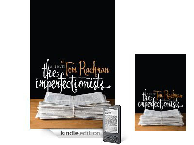
Here below there’s an example.
It’s a New York Times bestseller, in the paperback edition. Of course then the author hasn’t changed a little the cover while making the Kindle edition. However, here is where it fails. While this font is very readable in big sizes, when it comes to thumbnail we can’t read almost anything.
That’s another reason why if you want to publish both in ebook and paperback format it’s better to use different fonts while changing the format, or otherwise use one that is just clear and readable for both.


