It’s very good to look success stories of Indie authors. I guess everyone of you has made up his mind reading as much as possible on how to hit it big time.
However, let us concentrate on the cover part of success authors. Let’s start from a bestselling Indie book on Amazon: Hardline of Meredith Wild. She started as Indie, now she’s one of the New York Times and USA Today best authors – of course the story matters too.
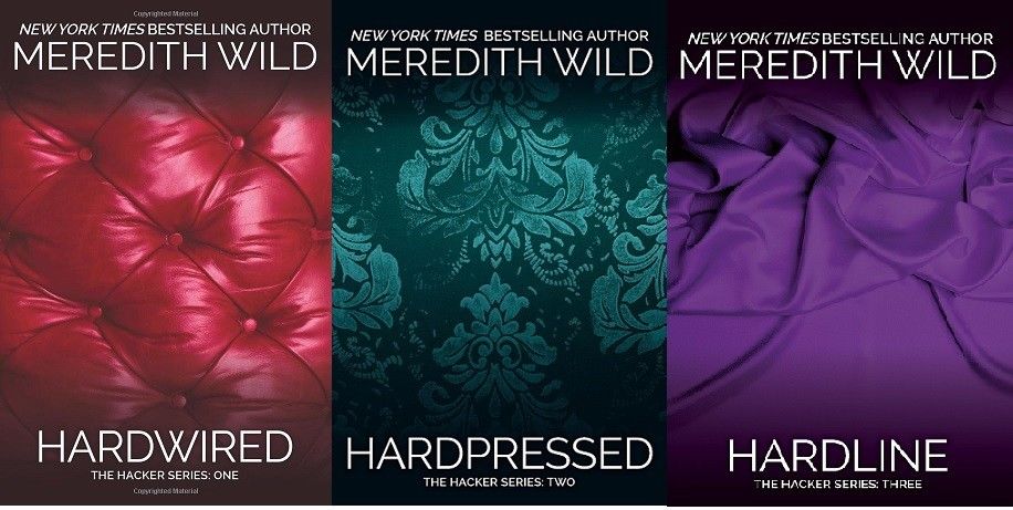
 Here’s the cover, on the left. As we caught some ideas and examples in the article about photos for kindle covers, here we find the same topic expressing itself. First of all, simplicity; second, an abstract image.
We have texts above and below, the photo is separating them, although in some other versions the photo comes up to the upper part of the cover.
The most important thing is that the image in the center convey us the book’s mood. Especially the purple color, with something that appears as a blanket, tells us there’s something about love. While the general dark colors suggest mystery.
We infer from the sub-title (the hacker series three) that:
1- it is about some spy-tech-story
2-it’s a series, so we think: let’s give it a try and then buy the other two books; or, let’s read the other books before.
So, photo plus title plus subtitle = mood of the story. We don’t have a clue what is the book about, but we can understand that is a hack loving story. Intriguing, isn’t it?
It’s an analysis to let you understand how to make your covers. Of course, don’t copy any example, but try to figure out what is the mood of your story, and put it in images.
That will work out with a very good cover for your book.
As you have also noticed in the cover image of this post, Meredith Wild has published other two books, with very similar covers. That makes sense if you want to write a series. Using the same style – and in this case, semplicity too – is a key component to let the readers recognize your works.