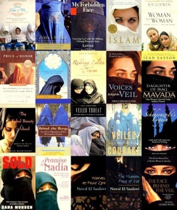
As we saw in a previous post, you have to be careful about clichés when designing your cover. We’ll see here other examples.
About Africa there were especially landscape clichés, but they’re not the only kind. There are others more symbolic that maybe we don’t even know are in ourselves. Let’s take an example: Islam. What are the first images of Islam today? Some of you will think about mosques and muezzin singing prayers; others to huge cities full of people in Islamic countries; to others still will come ideas of “jihad” warriors or similar types.
One common stereotype of Islam is the veiled woman. Also, and especially, in the Arabic literature there is a kind of obsession for this “cliché”. I’ll show you here below what I’m talking about.
As you can see, but there are examples coming out each month, it’s a common feature inside texts of this kind. Now, there is a pro and a con in it.
The pro is that these covers allow authors to be translated – and published – in Western countries to a wide audience. A veiled woman helps to convey a message of exoticism, therefore is good for selling the book. About the con, this could be one reason why readers leap to particular conclusions about an author’s narrative.
Other examples could be authors who use repeatedly the same kind of subject in many books cover – but this will reflect only the author’s style, not really a cliché.
There is a phenomenon now going on for novels in English-language but published in Asia, that is using generally a cover of a half-partially clothed woman with long black hair, either in silhouette, or viewed from behind. The title is usually something along the lines of Bangkok Velvet, and the author is always a white man.
Do you think you have spotted other clichés, or can you imagine which features are clichés? Or have you used them already in some book?
Share your examples, write to us and we’ll try to analyze them better, for you not to make this mistake anymore.

