
When you design your cover it can occur you fall into some clichés, which can be images, colours, backgrounds that are used in most of the covers for some topic.
Although it’s absolutely normal, you have to recognize the clichés and avoid them as much as possible. Something, anyway, most probably will slip you out, but don’t worry.
Let’s take an example: Africa. Have you noticed the covers of the books on this topic? I’ll show to you right below.
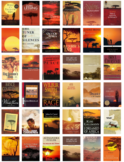
Noticing anything? Yes, the colours; and yes, the images. Also big authors fall into it (or their graphic designers anyway). It’s a common imagination, and in some ways it conveys to the reader what is the book about, or where the story is taking place.
Usually about Africa we can see: a sunset – or sunrise; an acacia tree; hot colours (which convey an image of hot temperatures), from yellow to red; some classic African animals, like elephants, giraffes, or lions.
Of course not every author had this idea for their covers. We can say, however, that is very common for a story which is set in Africa to have these features, despite the story has nothing to do with sunsets or acacia trees, or even animals.
How to prevent these clichés when you are designing your cover? Let’s give you some tips. Google on images “cover book Africa”, and replace Africa with your main object, and you’ll have a fair idea. Or go to an on-line book or ebook store and search “Africa”, all the book covers will come out.
You just have to have a little patience. Don’t stop at the first page, but go on for a while, to have a more complete idea.