Space is like drawing, and it’s like writing. You just have to be balanced, in harmony with every other object inside the cover. It’s the same as using metaphors in your writing, for example. You have to give them space, but you can’t neither give them too much space, otherwise everything will appear clumsy.
The problem is, one can think that because his cover will appear as a thumbnail on a store, it’s better to make everything as big as possible, to capture the reader’s attention. But it doesn’t work like that.
First of all, you should try, edit, erase and start over again many times before you get the best result. If you look for getting the whole space filled, try to do the opposite: leave as much empty space as possible. Use less objects.
Elements should capture the reader’s eye but not let it escape. So the best solution is to give the items a good space to breath.
Here below there are two examples.
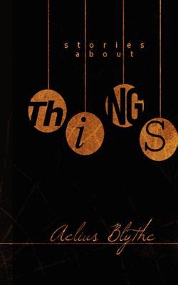
These covers are from good-seller Indie authors. Each one conveys its own mood through space too. We talked about colors’ use in this other post. What’s the main characteristic in these two covers? They are very much balanced, even if very simple too – as a matter of fact, you can make them in our creator. In the one on the left, there’s a picture in the middle, and a big title above, while in the one on the right the image is the title. In both cases, the author’s name is put below everything – it has to be the element with less importance.
But how they will appear in thumbnail? Let’s see.
 |
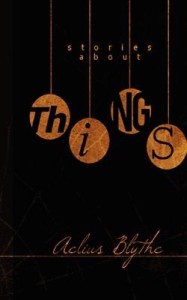 |
Of course we can’t see almost anymore the author’s name. But the first thing that will catch our eyes is the main title. In the first image, then, it will give us curiosity and still more the picture, so we’ll be encouraged to open it and look inside. The second one is giving us curiosity by the sense of mystery that is creating – and beauty too.
But the main thing, as you can see, is that there are very few elements inside, and lots of empty space. So that’s how it should be.