Among the many aspects one has to meet with, there’s the one of colors. It’s one of the most difficult to manage, but here we’ll explain some helpful tricks.
 It’s hard to use correct colors because they have to be in harmony among them, they don’t have to interfere neither stress items too much. Also, texts should be contrasted with background images, the latter maybe of many shades, dark and bright too.
How can we escape from being ordinary? Let’s see some suggestions.
The most important thing is offered by our creator, that is the opportunity to change the color in real-time while doing your cover. This will allow you to modify it and adjust it according to the items you’re using.
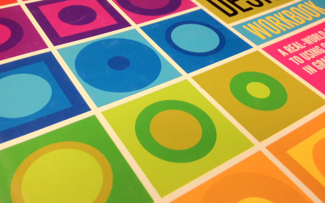
We have two kind of color usage. Thin colors or bold colors. In the first case you’ll have to use similar colors which will create harmony; in the second, you should create contrast instead. In any case, you should never use more than 3 colors in total – including images, shapes and texts.
As you can imagine, it’s better to avoid the strong primary colors, such as full red, full blue and full green. You can start from them, but later it’s better you create your own pattern or shade. Remember that a gradient, if used in a proper way, will give a sense of three dimensions to your objects.
There is another case: your story is set in a particular country, you can use the country’s flag colors, or very similar ones, with pictures of other kind.
One can also search on Google, for example, colors that work well together, or something similar, to get more information about complimentary colors and so on. Or you can look for color palettes. In such a way you can see all the colors next to each other, to have a proper idea.
Here below there are two examples.
 |
 |
Eventually, the most important thing is to try as much as possible new combinations, until you find the one that will convey the book’s mood.
As we could see in the book’s cover of Meredith Wild, she used dark colors inside, but just three of them: purple, black, and white with little yellow shade for the texts. Apart from these last ones which had to be contrasted to the rest, the colors are in harmony between each other and set the mood of the book.