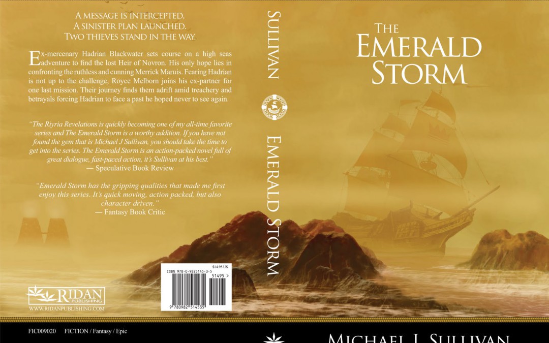
Micheal Sullivan, author of The crown conspiracy, has been publishing a lot since this book. He made a lot of way out of the market, but everything has started from this self-published book in 2008.
He’s an American author of epic fantasy & science fiction, best known for his debut series, The Riyria Revelations, which has been translated into fourteen languages, and which The crown conspiracy is a part. In 2012 io9 named him one of the “Most Successful Self-Published Sci-Fi and Fantasy Authors“.
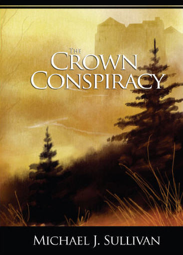
Let’s see the final cover chosen by the author to represent its book.
So, let’s start from the mood. This was the first Sullivan’s book, so nobody knew him, neither what kind of genre was the story about. Still, the first thing comes to impact our eyes is the title, especially the word “crown”. Then we pass to the background picture, and we see a nice, foggy landscape with some medieval city.
We can then infer that the book is about some mysterious story in the middle-age. The word “conspiracy” of the title fits with the picture we built in ourselves. As you can see there are no clues on what is really the story about, but that’s the point.
About the title, it’s written in clear, big, capital letters. As a thumbnail, both title and image are pretty clear.
Finally, the author’s name is in the bottom part, with a black rectangle as background. The font size is much smaller than the title, but it’s very much readable because of the contrast – white on black. In this case we can see that the author didn’t want to mark his name, sacrificing the title which was far more important; still, he wanted it to be clear, in case someone wanted to remember it.
That’s the key: be simple.
We also know a little about the cover creation process of Sullivan. He said in an interview: “We wanted to avoid placing any imagery of characters in the cover, to leave the reader free to imagine them as they wished. (…)
The cover that now appears on The Crown Conspiracy was originally conceived as a traditional watercolor, but I realized that I would not be able to digitize it to an adequate dpi for printing. I also wanted to have more control over the finished image, so that I would be able to adjust the height and/or width to accommodate text, or other formats such as bookmarks, that require more sky. In the end, I decided to create a watercolor image entirely in Photoshop.”
Of course you should be a good Photoshop user to get such a result. Still, you can modify any image that you can buy on some store, and use it as background for your cover. But we offer another option: you can browse our images database.
As final point, if you look at the cover image of this post, it´s presented another book of the author. It´s not from the same series, but you can clearly recognize the style: it’s very similar, foggy and misterious, with some picture of ancient times in the background. Most of Sullivan’s books are like this. A reader who loves his books will recognize them as soon as he see them, without even looking at the name on the cover.

