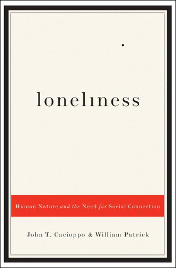
Simplicity is always the key. Here there’s an example of it. It’s so simple that we don’t even have to use many words to describe it. It’s a cover for an essay, but don’t you agree that it could be alright to use it for a novel too?
This cover follows all the rules we have written in our blog. The conceptual meaning of “loneliness” is represented by the small, isolated point. If we make it as a thumbnail, we don’t even see it. But it doesn’t matter, does it? Plain color, almost no graphic, but an effective visual concept.
One interesting point in this cover is about the title. We said already that the font has to be readable and clear. Are you noticing anything in this one? Maybe not, because it follows this rule. If, however, we look better, we see that the “i” is the 1 number. It’s very easy to create such an effect, and it’s very intriguing too for a reader.
The sub-title, as we can call it, is blank on a red rectangle. It’s almost not visible, with some words in italic and other ones that are normal. The effect comes out only when we have decided to enlarge the thumbnail on the store, so we get into some curiosity in reading what it’s not so much readable.
Finally, the authors’ names are in a smaller font in the bottom part. They are not marked, but still visible.

